Statement Of Intent
In my GCSE photography project, I am going to focus on the theme of portrait, I will take various types of portrait photos such as street photography, fashion photography and editorial photography. I think that it is important to do a variety of portrait photography so that I can be really creative with my work. This will allow me to find the portrait photography that is best for me. If I research lots of different types I will be able to work in many different styles and different set ups and I will also be able to use the skills I learn in other photoshoots. I have chosen this as my theme because there are so many different types which allows my insert lots of skills and compositional rules in my photos. This also allows my to show off my skills with the camera as there are so many different styles that portrait photography. I will also try to go further with my photography skills and try to do some complex edits. I will try to conduct a mood board to gain ideas of what type of edits to do. I will then narrow it down to three and do mood boards so I can see they different styles I could do the edit with. To understand how to complete the types of edits, I will search YouTube tutorials so that I can learn to do these.
To try and become successful with this project, I will research different types of photographers that specialize in portrait to inspire me and help me learn how to set up their equipment and how they use them effectively. For this project I could use photographers such as Dan Montford who takes photos and makes them into double exposure photos. He does this by using the analogue method that puts two photos over each other to blend them together however it keeps the photos basic colours to make it cleaner. Sasha Arutyunova who mostly uses lifestyle portrait and makes it realistic and shows that it is natural which can be very effective. I could also research Mateusz Lengling who does lots of editing in his photography work which makes it standout as he will be able to edit and change the photo to pop out or become more interesting. I can research these photographers so that I can learn how they take their photos as they all take different styles of portrait so I will be able to work in their styles effectively. I think that it is important to research lots of different poses and ways you can take the photo and the different backgrounds and backdrops to make my photos successful. I will go into many places with amazing scenery to be able to make my photos become more complex and I can become more successful with my final product. To gain a better understanding, I will watch YouTube tutorials of famous photographers so that I can attempt to work in their style and gain a better result by gaining inspiration of a well known photographer. By dong this, I will be able to improve my work and knowledge even further. The tings I could use to research, is Instagram accounts, YouTube tutorials and magazines to increase my knowledge
In this project, I intend to complete many different types of portrait photos and make galleries containing the photos I will take. I will take a shoot at Salford Quays as I will use the scenery's it has and make Daniel my model to take pictures of. I will use different compositional rules that I learnt to do in my texture project. I will also do shoots with my other peers and will try to experiment with different camera settings. I will also do a sportswear shoot and I think that Tauseef would be a good model for this shoot. I will try to also use different photographers as inspiration as inspiration so that I am able to take high quality and professional photos. I will also try to look at edits from photographers and make a mood board so that I can find which type of edit I like the most. I will then look at YouTube tutorials so that I can understand how to do the edits and complete them on photoshop. I will also try to combine the edits I have worked on so I am able to go into more depth.
Mind Map

Analysis

This photo was taken by Dan Mountford who was born in 1948 in Milton Keynes however he currently lives in Brighton. He studied Graphic design at the University of Brighton. He is a freelance graphic designer and photographer. The fade effect the photographer uses is very clever as it makes the photo seem like a dream. He uses double exposure to take his photos, Not from Digital cameras but from Hulga cameras which are used to make films and he stated “learning to do that on film was quite a process involving trial and error.” Dan Mountford makes his photos by exposing single frames of film twice. The photos look like manipulations done with fancy image editing programs however Mountford relies on the camera work for the images leaving modifications to post processing https://www.thephoblographer.com/2015/12/05/daniel-mountfords-double-exposures/
This is a portrait photo showing a woman looking into the distance with double exposure of a bright blue sky with white clouds. This photo makes me think that the double exposure is showing a memory of some sort.
The woman in the photo looks like she is looking in disbelief as if she is looking at a forgotten memory. The photo is really dull and doesn't have a lot of colour however you can still understand what the photographer is trying to show. Mountford could have purposely done this to set the mood of the photo. The photographer uses a low depth of field around F-8 and takes the photo from a worm's eye view. The photo shows a lot of skill and I think that the way the woman is looking away from the camera makes it really mischievous as it allows the viewer of the photo to use their imagination so that they will be able to understand what the woman might be looking at. In this photo, the woman looks weakened as if this sight is very special to her and makes her fall into awe. The photo also has the use of texture with the rocky mountains and snow so there is more skill being used in this image. The photo is very exposured however it is also distorted as it is faded, this means that the shutter speed might of bee higher so that it can allow more light to shine through the lens. Implying this I think that the Shutter speed will be around 3 seconds.
The image uses compositional rules to make the photo more impressive as he has used worms eye view showing from under her face which allows more emotion to be shown by the use of angles. The photo has leading lines with the mountains and strands of hairs and the diagonal lines from the clouds coming towards the face. The woman is also placed in the middle which is another compositional rule and this will allow more of the photo to be seen and admired. Mountford also just focused on the face in this photo as he has done a close up on it. This is clever as it allows him to get across how the woman is feeling. The background doesn't look natural so Mountford may have used edition tools to change the colour of the background which shows a lot of dexterity in many different areas of photography. By changing the colour to this it contrasts with the skin tone as they both have the same tone.
This image shows a lot of skill as many aspects have been used such as compositional rules, editing and double exposure. The use of these makes the photo stand out and be unique. Mountford has really thought about the colours he has used to make the photo look more affectionate. I would try to take a photo like this because it shows a lot of skill to do and will help my skills to improve. I will be able to improve on my compositional rules and ways to take pictures as this is quite unique. With this sought of photo I will have to think about my arrangements so that it can contain more emotion like this photo. The positioning of the camera when the photo was taken is more effective because he has used worms eye view, this makes the photo look better than if t was taken from a normal angle.
Analysis 2

In the photo, it shows a woman looking through some flowers, however the photographer only took a photo of half of the woman's face. The photographer has made the photo have a low aperture so that the flower is out of focus. The contrast of the colours with the purple and pink lips. By making the lips this colour, it makes it stand out as it is a bright colour where as the face is quite pale. This makes it stand out because pink and purple are harmonious. The blue eyes looking straight at the camera is also next to purple on the colour wheel which makes it stand out. The photo uses the compositional rule of close up as the photo is taken close to her face. This is effective as it leads to mystery about what is on the other side of her. The woman is looking directly at the camera however her face shows a calm and relaxed expression. This shows that she is at peace and also makes the viewer seem calmer as well. The woman is holding up a flower however it is out of focus at the front of the screen, this shows that the photographer has used a low F-stop around F-4. Using the flower is very clever because a flower has a connotation to peace and calmness which is clever and intrigues the viewer. The photographer has made the photo so that it is not too dark or not too light. The day looks quite bright and sunny which means that the photographer could have used the white balance of daylight so that the camera is not over exposed.
I like this piece of work because it looks really effective and the photographer has made the photo look calming and shows emotion in the photo. The photographer also used compositional rules such as close up and this makes it look amazing to the viewers. The photographer positions the woman cleverly so that the photo can feel more relaxing and soothing as it uses natural props such as flowers which soothes the viewer. The photo uses some leading lines using the shadow of the stem of the flower. This leads the viewers eyes more to the center of her face. This photo links to mine as it is a portrait photo which uses different techniques which I can try to use in my photos to make it look even better. The photo is very cleverly taken because the arrangements of the photo are taken so everything articulates to the audience. This is shown as the flower popping out really catches the observer's eye and the colour also makes it contrast. The blue eyes also are really captured in this image as there is not a lot of colour in this image so the blue is emphasized in the photo. The photo uses rule of thirds to make the photo more spaced out with the flower on the top and so that it is not covering any of the face
I will try to take photos like this in my photoshoot as it looks great and it can also help me to make my photos positioning better as I can use this photo as inspiration as this photographer has used positioning and composition really well in the image. By looking at this photo in detail I can understand how to take a good photos using rule of thirds, aperture and composition. I think that it is useful to understand these skills as it will help me to take amazing photos as these abilities are handy in all photos. In this sort of photo I will need to focus on my arrangements and colour such as this photographer does in this photo. Using ideas from this photo will strengthen my work as it uses clever ideas which would be able to strengthen my photos.
Analysis 3

This photo shows a man looking into the distance which makes me contradict if he is seeing something heartwarming or something that he finds special to him. The colours are dull and the facial expressions of the man makes the reader feel that the man is hurt in some way as he looks as if he is weakened. To emphasize that the man feels down the photographer edits the photo black and white as it has no colour which makes it look dull. The photo contains compositional rules such as leading lines which are used by the use of trees and mountains and trees that the photographer has used to make the photo look fascinating, Also the use of doing this makes the photo have a bit of a natural texture to it. To empathize that the photographer photoshops the photo to black and white which shows that skill in editing and it also helps the photo look more emotional. The photographer also edits the man's body to be filled with mountains and trees which also shows a lot of skill in his editing. This looks effective as it could be a memory of the man and he is remembering a time that he has had. I think that the photographer has used a low F-stop around F-4 as it is not that far away from the camera. The photographer having the trees and mountains in his body shows skill will double exposure which allows you to merge two or more photos together.
I like this work as it shows emotion in the man's face and it shows the photographer's editing skills. The piece of work is also positioned well as the man is not looking straight at the camera which can show that it is a bit more natural. The photographer has also used compositional rules such as leading lines which makes the photo look more effective to the viewer as it makes the reader follow the lines of the trees and mountains and wants to know what's on top. The photo is taken so that we are able to imagine the textures, this is because it shows trees with many branches and sticks coming off it with makes the viewer feel as if it is quite spikey. The man looking into the distance also makes it more acknowledged as it makes the viewer want to know what is making the man feel the way he is. The photo uses rule of thirds as it is split into three columns. Photographers use this to lead the viewers eyes to the important aspects of the photo. The image could have used a low aperture for the man as it is quite close which means that the F stop is around 4. However the photo taken for the mountains could have used a higher F stop around F7 as it is a scenery photo which looks like it is taken from far away.
This image links into my portrait project and I could use my texture project to get photos for the double exposure. This will look really good as it is showing a lot of skills and emotion in just one photo. By doing this, I am able to take unique photos. It also uses many different compositional rules which shows skill with a camera. The compositional rules that I could use is rule of thirds, symmetry and leading lines. This will look very professional on my website as if I watch a tutorial on how to do a photo like this it will look amazing. I am able to show my skills with editing if I take a photo like this as the photographer makes the photo black and white and uses double exposure. This will be a difficult photo to complete however will be appealing because it is very unique to most photos I would normally see.
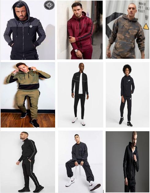
Poses Mood board
Edit Mood Board
Plan for Shoots
Name: Nihaal Singh
Project Title/ shoot number: Shoot 1 - Sportswear
Description of aims for shoot: For this shoot I aim to take photos in a studio focusing on sports wear. I want to do this by taking photos in a studio using different types of poses and equipment.
Links with Photographers: I will be working in the style of Jay mason who is a sportswear and fashion photographer.
Location: The photos will be taken in a studio
Props/ items needed: Sportswear/Sports equipment
Kit needed e.g. lighting, tripod, backdrop, macro lens: Lighting/Backdrop/blue tack
F-Stop: F/5.8
White Balance: Shade
Shutter speed: 1/30
ISO: 600
Which compositional rules will I use?
I will use compositional rules to make my photos look more interesting. Some of the compositional rules I will use are: leading lines, symmetry, birds eye view and worm's eye view. I will use symmetry to make the photo look the same on both sides and not too complicated. I will use worm's eye view and bird's eye view to make the photo more interesting and show the view from different angles. I will use leading lines to make the viewers' eyes somewhere and leave them with a sense of mystery of where it is leading.
Rugby


Worst
|
Best

|
|
This is my worst photo because I have not thought about the facial expression and it looks unprofessional. I have also not thought about the framing as it does not look appealing. I could have also made the photo brighter as it is a bit dark and the face needs brightening. I could have done this by increasing the ISO.
|
This is my best photo because it is really in focus. It also is a really natural picture the way the model is not looking straight at the camera. The photo is not too bright or not too dark which shows I have used an ISO around 500. I have used a whit balance of sunlight because the photo was taken outside and was very bright.
|
Cricket


Worst |
Best |
|
This is my worst photo because it is a little bit dark. To make it lighter I could of used a different white balance. The photo isn't positioned properly because you can see outside the background. The facial expression could also be improved to make the photo more appealing.
|

This is my best photo because it is not too dark which means I used a white balance such as sunshine. The photo is in focus which means I would of used a F-stop such as F-4. The photo doesn't look too positioned and looks more natural and so does the facial expression.
|
Position


Worst |
Best |
|
This is my worst photo because it is not in focus. To improve this I could of adjusted the manual focus on the lens. I should of also changed the whit balance because it the photo is a bit dark. I should of changed the F-stop because it is slightly out of focus so I should of used a F-stop of F-6
|
This is my best photo because it is in focus which means would of used a F-stop around F-4. The photo is also clear to see which means I used the white balance shade. The photo is also not too grainy, this means that I used a ISO around 500 so that the photo didn't look too dark or too grainy.
|
Edits


Before
|
After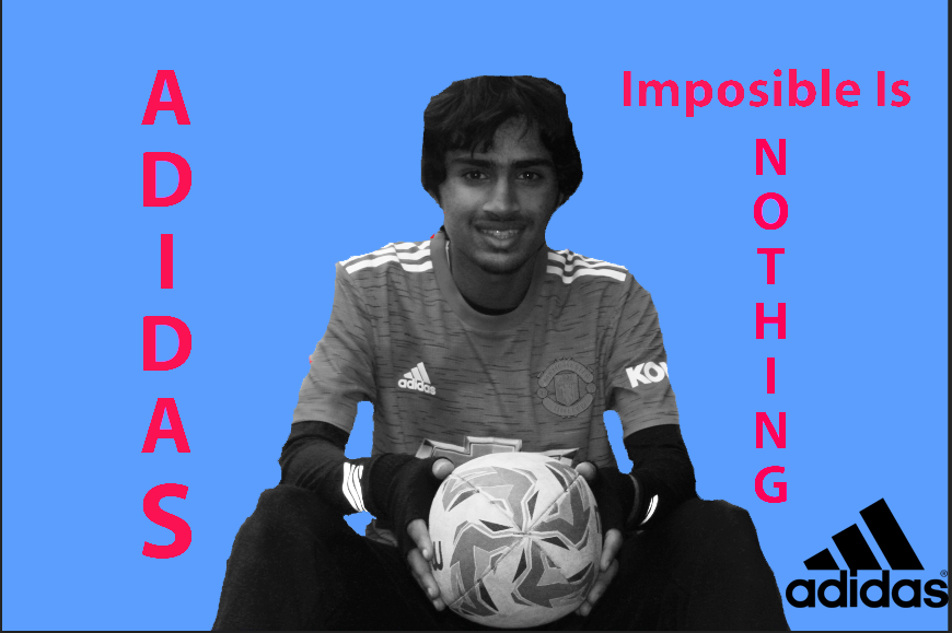
|
Shoot 2


Best |
Worst |

|

|
|
This is my best shot because it is really clear and in focus. I used a close up which means I would have had to use a F - stop around 3 so that that I could also make the background out of focus. The colours in the photo are pop out and are bright colours which it is really attracting to the viewer. By doing this shows I have used an ISO of around 600.
|
I chose this as my worst photo because it is quite dark and is hard to see the model. Although the positioning is really good the colours are very dull which makes the photo less appealing. I think I could make this photo even better by using a higher ISO around 500. I could have also changed the white balance to sunlight because there was a lot of light coming into the lens of the camera. To improve this image, I could edit the photo and brighten it.
|
Shoot 3
Shoot with Ismail


Best
This is my best photo because it is in focus and the pose is thought out. By doing these two things, it really makes the photo stand out The bright yellow jumper really pops out which can catch peoples eyes, it is in focus and I have used an ISO of 400 and a white balance of fluorescent light .
|
Worst
This is my worst photo because it is not in focus. Also the ISO I have used was quite low as the photo doesn't have a lot of colour which means the ISO used is around 200. The framing of the photo does not look appealing as it is not creative and people.
|
Shoot with Luke


Best
This photo is my best because it is in focus and it and I have used the lighting well as it is not too bright or too dark. The ISO I have used is around 400 as I was indoor and used lighting. I used a low aperture as the photo was from close which means I would have used an aperture of F - 3. I would of used a fast shutter speed as there was already quite a lot of light in the room. I used a close up on the face and not an all body shot. I also used a birds eye view as I took the photo from above the model which looks alluring to the viewer.
|
Worst
This is my worst photo because it is not in focus and I have not thought about when I should take the photo. This is because the eyes are closed and doesn't look good to look at. The ISO is too high which is resulting in the photo being grainy and noisy. To make this photo better I could have used an ISO of 300 I could have also used a higher F stop to around F - 4 so that the photos aperture used could have been higher which would blur out the front of the image.
|
Shoot with Laibah


best |
worst |
|
This is my best image because it is in focus and intriguing with the bright yellow background. Using the bright yellow background catches the viewers eyes. I used an ISO of 400 as there was a lot of light coming in the photo and using this ISO made the photo really clear. Using a white balance of florescence light makes the photo really clear and makes the colours stand out.
|
This is my worst image because because it is really out of focus and unbalanced. I have made my ISO too high which has made it too grainy, The white balance I have used is also not on the right setting which makes it the colour not pop out as much. To improve this image, I will need to change the ISO, white balance and the focus.
|
Street photography mood board


Salford Quays
War Museum


Best
I think that this is my best photo because it is showing a bit of professionalism with the facial expression and the pose of his body. The clothes he is wearing also matches with the with the grey background and the photo is also in focus. I have used the lighting cleverly as it contrasts from dark to light which I think looks very affective in this photo. I used a white balance of sunlight as it was quite sunny and bright and I used an ISO of around 500-600. I would of needed a fast shutter speed as I would of needed less light coming into my lens as it was already a lot of sunlight.
|
Worst
I believe that this is my worst photo because it does not really look appealing. I think this because I have not really thought about the way the photo was taken because the eyes are closed and I have also not thought about the pose and he is just standing there. Also the background doesn't look very appealing and I have not thought about where I should stand to get the full background in. The lighting in the background is also very bright so I should of changed the white balance so it wasn't so bright. I could of also changed the shutter speed to faster so that there is less light getting in to the lens and the photo.
|
Bridge


Best |
Worst |

I chose this as my best photo because it is effective with the models pose. The background is also a looks interesting with the buildings. The photo is in focus which makes the photo look more professional. I have used an ISO of around 600-700 and I have used a F-stop of 6 so I could get the background and the foreground. I could of made this photo better by using a higher shutter speed so that it could get more light in the photo. However, I could do this by photoshop and edit the photo.
|

I think that this is my worst photo because it is quite a simple pose and the models eyes are closed, this makes the photo look less professional. I could of also made the background better as the buildings are not fully visible and are uneven which makes the photo look less appealing. I could of used different levels so that the photo could have more positioning and the background could be more better.
|
Gardens


Best
I think that this is my best photo because the pose that my model is using a pose that us unnatural and looks unique. The lighting comes from natural sunlight and it brings out all the plants from the background as well as the model. All the sunlight made me uses the sunlight white balance so that the photo is not over or under exposed. I used an ISO of 300 - 400 as it allows the picture not to be too grainy or too light. I have used an aperture of F6 so that I can get the background and the model in the phot without it being out of focus.
|
Worst
I think that this is my worst photo because the positioning is not so great. There is not a lot of light coming into the photo as well so I think that I should of changed shutter speed so more light could enter the lens. I have also not thought of the background as there is a bag lying on the floor which makes it looks unprofessional. There is no facial expression which makes the photo look dull.
|


Best |
Worst |

|

|
|
This photo is my best photo because it goes from highly exposured to very little exposured which makes it stand out because it makes to sky stand out and the lower part of the picture seem normal. The body posture is unnatural which makes it a very good photo. The building in the background makes it look interesting because it is a weird shape.
|
I think that this is my worst photo because it is too over exposured so that it is too bright. The pose is also not appealing as it is very simple and shows not emotion. The face looks very blank and it has no meaning which I don't think looks good.
|


Best
This is my best photo because it looks really appealing. This is because it is in focus and note over or under exposured. The pose is also look unnatural as he is not looking straight at the camera. I have used levels so that I'm am looking from a worms eye view up at him. I have used the white balance of sunlight as the photo has a lot of natural sunlight. I have used the stop of 6 as the background is not out of focus.
|
Worst
This photo is my worst because it is is over exposured and too much sunlight is coming in. I could of changed the position of the the photo as where I took the photo, too much sunlight was coming through which makes the image look less effective. The background doesn't look very appealing as well.
|
Street Photography Edit Mood board 1


Mood board 2


photoshoot

|

|
Edit 2


Before
|
After
|
Edit 3


Before
|
After
|


Best
This is my best image because the pose is eye catching. The photo is also in focus. The yellow top draws your eye to the model as it stands out and emphases the photo. I used a white backdrop because it makes the model stand out more and draws the views eyes towards the model. The ISO I have used is around 400 as I wanted to make the photo as clear as I could. The shutter speed would have bee quite fast as I used lighting and I didn't want the photo to be too bright .
|
Worst
This is my worst image because it is really out of focus. To change this, I should have changed my focus on my camera. Also I could have also used a higher F - stop so I could have made the photo more focused. The way I have taken the photo isn't very alluring as it shows no skills as no compositional rules have been attempted. I could have maybe done a photo from birds eye view so that it showed a bit more skill and positioning.
|
Laibah


Best
This is my best photo because it is in focus and looks appealing. This is because the model is not looking straight at the camera, this shows naturalism which shows skill. The white balance I would have used is florescence light as I took it in a studio. I would have used an ISO around 400 so that it is not too grainy and not to dark. The shutter speed would have been quite fast as I had lighting meaning I wouldn't of needed that much light entering my lens.
|
Worst
This is my worst image because it is really out of focus and doesn't catch the viewers eye. I would have needed to change the focus on my camera so that it wasn't out of focus. I could have also changed the shutter speed so it was a bit faster because . photo looks a bit dark. I could have used some compositional rules such as worms eye view so that it was more interesting as the photo looks too simple.
|
Amal


Best
This is my best photo because it is in focus and shows professionalism. This is because by the model not looking at the camera, it gives it naturalism. The ISO I would have used would have been around 400 as lighting was used. The aperture would have been low because it is a photo being taken from close so it would have only needed to be around F - 4.
|
Worst
This is my worst photo because I have not thought about the way I was taking my photo as the models eyes were closed. I should have also thought more about my positioning as the model wasn't even looking at the camera.
|
Danial


Best
This is my best image because it is in focus and shows skill. This is because I have used a birds eye view to take the photo and the image is not too bright or dark. I have done this by making the ISO around 400 because as I have also used lighting so it doesn't need to be too bright. The model is looking down and not at the camera making it more natural. I used a low aperture because the photo is being taken from quite a small distance meaning the aperture only needs to be around F - 4
|
Worst
This is my worst image because it is not in focus and doesn't show a lot of professionalism. The model is not looking at the camera nor is it more natural it looks completely random. The ISO I used should have been higher around 500 as the photo looks dark and not very clear.
|
Isabella


Best
This is my best photo because it it is in focus and it is is quite an unnatural pose. This makes the photo quite unique. The photo is not too bright and not too dark meaning the photos ISO is around 400. It is around this number because I also have lighting meaning it doesn't need to be as high. The F - stop I have used is around 4 as it is not a photo being taken from far range.
|
Worst
This is my worst photo because it is out of focus. I could have made this better by changing the focus on my camera. I could have also made the photo brighter using a higher ISO to around 400 or shutter speed to let in more light. However, other than that the photo and positioning looks quite good.
|
Salford Quays Edit


Before |
After |
Mock Edit


Shepard Ferry Mood board


Photos of musicians


Album covers
Canva 1
Steps


Before
|
After
|
Canva 2
Steps


Before
|
After
|
Canva 3
Steps


Before |
After |

|

|
Canva 4


Before
|
Worst
|
Poster


Before
|
After
|
GCSE Edit


Before
|
After
|
Final Pieces


Evaluation
In this project, I focused on the theme of portraits and I thought it was very interesting as they are completely different compared to the texture project and I found it a lot easier as I was more confident with using the camera. Overall I thought it was fun to do and I really enjoyed it and I feel I have learn a lot from doing this. I really liked the photo shoots we did and I think it was my favorite thing from this. I really got to use more of the camera settings in this theme which I loved and I also got some really got shots. However I would have really liked to improve on my editing as I found it quite difficult. I would also have liked to use more poses as I think it would have made the website have more compelling and intriguing. In this project, I worked I analyzed a piece of work from Dan mount who I though took very good pictures as he used a lot of skill when photographing. I also tried working in the style of Magdiel Lopez who's edits were amazing however was quite tricky to do. These photographers have influenced my work by making me work in a certain way so that I can try and work in the style of them which taught me a lot skills that I could use in the future. I thought my analysis held a lot of information and were very good so I believe that these were my most successful part. However I believe that my timings were very slow especially with my edits so I would need to work on them. If I was to do this project again I would want to change the amount of time I spent on my edits as I spend very long to complete one.
